| Oracle® Application Express Application Builder User's Guide Release 3.2 E11947-03 |
|
|
PDF · Mobi · ePub |
| Oracle® Application Express Application Builder User's Guide Release 3.2 E11947-03 |
|
|
PDF · Mobi · ePub |
As you design your application, you can use buttons to direct users to a specific page or URL, or to post or process information (for example, by creating Create, Cancel, Next, Previous, or Delete buttons).
Buttons can perform two different types of actions. A button can submit a page and then redirect to a URL. Alternately, a button can branch to a URL without submitting the page, such as for a Cancel button.
Topics in this section include:
See Also:
"Calling a Page from a Button URL"You create and edit buttons on the Page Definition. The Buttons section appears in the Page Rendering area. See "Accessing a Page Definition".
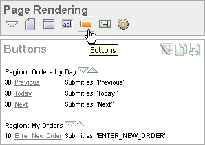
You can temporarily hide all other subsections by clicking the Buttons icon. To restore the view, click Show All. The Show All icon resembles an inverted triangle.
The following icons display next to the section title:
Edit All. The Edit All icon resembles a small grid with a pencil on top of it. Use this icon to edit all buttons at once.
Copy. The Copy icon resembles two small overlapping pages. Use this icon to make a copy of an existing button.
Create. The Create icon resembles a plus (+) sign overlapping a small page. Click this icon to create a new button.
Buttons are organized by region. To edit a button, click the button name.
See Also:
"Editing Buttons"You create a button by running the Create Button Wizard from the Page Definition. Each button resides in a region. A region is an area on a page that serves as a container for content.
To create a button:
Navigate to the appropriate Page Definition. See "Accessing a Page Definition".
If necessary, create an HTML region. See "Understanding Regions".
Under Buttons, click the Create icon.
The Create Button Wizard appears.
Select a region to contain the button and click Next.
Select a position for the button and click Next:
Create a button displayed among this region's items - Select this option to display the button within or between page items (for example, to add a button directly to the right of a form field).
Create a button in a region position - Select this option to place the button in a region position. A region position is a position defined by a region template.
If you select Create a button in a region position:
Specify the Button Name and Label.
Select a Button Type: HTML Button (Default), Image, or Template Driven
Select Button is Reset to create an Undo button. When enabled, this type of button resets the page values to the state they were in when the page was initially rendered.
Select an Action:
Submit page and redirect to URL submits the current page to the Application Express engine whenever a user clicks the button.
Redirect to URL without submitting page avoids submitting the page. Choose this action when submitting the page for processing is not necessary (for example, a Cancel button). This action avoids processing in the database and therefore reduces the load.
Click Next.
If you select Create a button displayed among this region's items:
Specify the Button Name and Sequence.
Specify if the button displays at the beginning of a new line or new field.
Specify a Label.
Enter the value of Request.
Select the Button Style.
Click Next.
Follow the on-screen instructions. To learn more about a specific field, click the item label.
When Help is available, the item label changes to red when you pass your cursor over it and the cursor changes to an arrow and question mark. See "About Field-Level Help".
Buttons can be placed in a predefined region template position or among items in a form. To create an HTML button, select one of the following while running the Create Button Wizard:
Under Task, select Create a button in a region position.
Under Button Type, select a button type and then HTML Button (default).
You can create multiple buttons within the same region at once using the Create Multiple Buttons Wizard.
To create multiple buttons at once:
Navigate to the appropriate Page Definition. See "Accessing a Page Definition".
If necessary, create an HTML region. See "Understanding Regions".
Under Buttons, click the Create icon.
The Create Button Wizard appears.
Select Create Multiple Buttons at the bottom of the page.
The Create Multiple Button Wizard appears.
From Place Buttons in Region, select the region to contain the buttons.
From Template, select a template.
In HTML Attributes, specify HTML attributes for these buttons. This text will be added to the HTML element definition. For example, you could set the class of a text button as follows:
class="myclass"
To quickly populate the remaining fields, make a selection from the Quick Button list on the right side of the page.
Click Create Buttons.
When you want to edit a button, you start from the Buttons section on the Page Definition. You can edit the attributes of a button, edit multiple buttons at once, or change a button position within a region.
Topics in this section include:
See Also:
"About the Edit All Icon"You can edit button attributes on the Edit Pages Buttons page.
To edit attributes for an existing button:
Navigate to the appropriate Page Definition. See "Accessing a Page Definition".
Under Buttons, select the button name.
The attributes page for the button appears.
To learn more about a specific item on a page, click the item label.
When Help is available, the item label changes to red when you pass your cursor over it and the cursor changes to an arrow and question mark. See "About Field-Level Help".
Click Apply Changes.
You can edit multiple buttons at once by clicking the Edit All icon on the Page Definition. The Edit All icon resembles a small grid with a pencil on top of it.
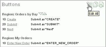
Clicking the Edit all icon displays the Buttons page, which contains a table listing the buttons in the region. Use this icon to edit multiple buttons at once.
From the Buttons page, you can delete multiple buttons or view a history of recent changes.
To edit multiple buttons:
Navigate to the appropriate Page Definition. See "Accessing a Page Definition".
Under Buttons, click the Edit All icon.
The Buttons page appears.
Edit the attributes on the Buttons page, or click the Edit icon to edit the attributes for a single button.
Click Apply Changes.
To delete multiple buttons at once:
Navigate to the appropriate Page Definition. See "Accessing a Page Definition".
Under Buttons, click the Edit All icon.
Click Delete Multiple Buttons.
The Delete Multiple Buttons page appears.
Select the buttons to delete and click Remove Buttons.
You can quickly edit a button label or change a button position within a region by clicking the Reorder Region Buttons icon on the Page Definition. The Reorder Region Buttons icon resembles a light green downward arrow and upward arrow and displays next to the region name.
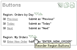
To edit buttons using the Reorder Region Buttons icon:
Navigate to the appropriate Page Definition. See "Accessing a Page Definition".
Under Buttons, click the Reorder Region Buttons icon.
The Reorder Buttons page appears. Use this page to edit the button label, select a region position, or change the button order.
To edit the button label, enter a name in the Label field.
To change the region position, make a selection from the Position list.
To change the order in which buttons display, click the up and down arrows in the far right column.
Note that you can also control the order in which buttons display by editing the Sequence attribute. See "Editing Button Attributes".
Click Apply Changes.
Note:
To change the region where a button resides, you must edit the button attributes. See "Editing Button Attributes".The name you give a button determines the value of the built-in attribute REQUEST. You can reference the value of REQUEST from within PL/SQL using the bind variable :REQUEST. By using this bind variable, you can conditionally process, validate, or branch based on which button the user clicks. You can also create processes that execute when the user clicks a button. And you can use a more complex condition as demonstrated in the following examples:
If :REQUEST in ('EDIT','DELETE') then ...
If :REQUEST != 'DELETE' then ...
These examples assume the existence of buttons named EDIT and DELETE. You can also use this syntax in PL/SQL Expression conditions. Be aware, however, that the button name capitalization (case) is preserved. In other words, if you name a button LOGIN, then a request looking for the name Login will fail. For example:
<input type="BUTTON" value="Finish" onClick="javascript:doSubmit('Finish');">
Note that in this example Finish is the name of the REQUEST and this example is case-sensitive.
Each page can include any number of branches. A branch links to another page in your application or to a URL. The Application Express engine considers branching at different times during page processing. You can choose to branch before processing, before computation, before validation, and after processing. Like any other control in Application Builder, branching can be conditional. For example, you can branch when a user clicks a button. When you create a branch, you associate it with a specific button. The branch will only be considered if a user clicks the button.
See Also:
"Controlling Navigation Using Branches"You can choose to have a button display conditionally by editing attributes on the Edit Pages Button page.
To have a button display conditionally:
Create the button. See "Creating a Button Using a Wizard".
Navigate to the appropriate Page Definition. See "Accessing a Page Definition".
Under Buttons, select the button name.
The attributes page for the button appears.
Scroll down to Conditional Button Display.
Make a selection from the Condition Type list.
Enter an expression in the fields provided.
Click Apply Changes.
See Also:
"About Bind Variable Syntax"
|
 Copyright © 2003, 2013, Oracle and/or its affiliates. All rights reserved. Legal Notices |
|