| Oracle® Application Express Application Builder User's Guide Release 3.2 E11947-03 |
|
|
PDF · Mobi · ePub |
| Oracle® Application Express Application Builder User's Guide Release 3.2 E11947-03 |
|
|
PDF · Mobi · ePub |
An item is part of an HTML form. An item can be a text field, text area, password, select list, check box, and so on. Item attributes affect the display of items on a page. For example, these attributes can impact where a label displays, how large an item is, and if the item will display next to or below the previous item.
Topics in this section include:
See Also:
"Understanding Application-Level Items", "How Item Attributes Affect Page Layout", "Understanding Substitution Strings", and "About the Item Finder"There are two types of items: page items and application items. Page items are placed on a page and have associated user interface properties, such as Display As, Label and Label Template. Examples of page-level items include a check box, date picker, display as text, file browse field, popup list of values, select list, or a text area. Application items are not associated with a page and therefore have no user interface properties. You can use an application item as a global variable.
See Also:
"Understanding Application-Level Items"You create and edit page-level items on the Page Definition. The Items section appears in the Page Rendering area.
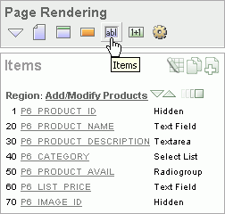
You can temporarily hide all other subsections by clicking the Items icon. To restore the view, click Show All. The Show All icon resembles an inverted triangle.
The following icons display next to the section title:
Edit All. The Edit All icon resembles a small grid with a pencil on top of it. Use this icon to edit all items at once. See "Using the Edit All Icon to Edit Multiple Items".
Copy. The Copy icon resembles two small overlapping pages. Use this icon to make a copy of an existing item.
Create. The Create icon resembles a plus (+) sign overlapping a small page. Click this icon to create an item.
Items are organized by region. To edit an item, click the item name.
You can quickly change the appearance of a page by clicking the Drag and drop icon to access the Drag and Drop Layout page. The Drag and drop icon resembles a green rectangle and displays to the right of the Reorder Region Items icon.
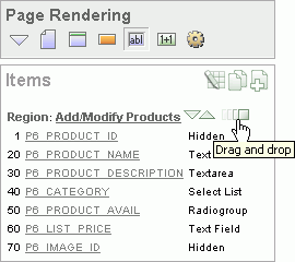
You can use the Drag and Drop Layout page to interactively reorder items within a given region, change select item attributes, create items, or delete existing items. See "Using the Drag and Drop Layout Page".
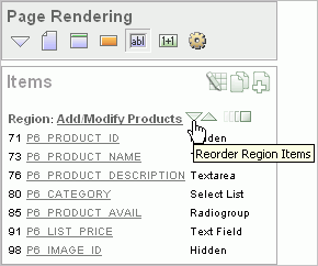
You can quickly edit the label and position of items in a region by clicking the Reorder Region Items icon on the Page Definition. This icon resembles a light green down or up arrow.
See Also:
"Using the Reorder Region Items Icon"You can create page-level items by running the Create Item Wizard.
Topics in this section include:
You create a page-level item by running the Create Item Wizard from the Page Definition.
To create a page-level item:
Navigate to the appropriate Page Definition. See "Accessing a Page Definition".
If necessary, create an HTML region. See "Understanding Regions".
Under Items, click the Create icon.
Select an item type. See "About Item Types".
Follow the on-screen instructions.
To learn more about a specific field, click the field label.
When help is available, the item label changes to red when you pass your cursor over it, and the cursor changes to an arrow and question mark. See "About Field-Level Help".
When specifying an item name, remember the following rules. Item names must:
Be unique within an application
Not have quotation marks
Begin with a letter or a number, and subsequent characters can be letters, numbers, or underscore characters
Be case-insensitive
Should not exceed 30 characters
Cannot contain letters outside the base ASCII character set
When you create an item, you specify an item type. Once you create an item, these types appear on the Display As list on the Edit Page Item page. Table 6-2 describes available item types.
Table 6-2 Available Item Types
| Item Type | Description |
|---|---|
|
Displayed using a list of values. A list of values is required for items displayed as check boxes. The value corresponding to a checked box is returned in a single colon-delimited string. The following example demonstrates how to create a single check box that returns SELECT NULL display_text, 'YES' return_value FROM DUAL; This example includes the additional text Click to select. SELECT 'Click to select' display_text, 'YES' return_value FROM DUAL; See Also: "APEX_UTIL" in Oracle Application Express API Reference for information about breaking up returned values |
|
|
Displays a text field with a Calendar icon next to it. When clicked, this icon displays a small calendar where the user can select a date and a time (optional). If the format you need is not included in the Display As list, select Date Picker (use application format mask) or Date Picker (use item format mask). The latter uses the value from the Format Mask field in the Source section of the Edit Page Item page. |
|
|
Available Display As Text subtypes include:
|
|
|
Displays a text field with a Browse... button. The Browse button enables the user to locate a file on a local file system and upload it. Oracle Application Express provides a table for these files to be uploaded to and an API to retrieve the files. See Also: "Securing File Uploads" |
|
|
Renders an HTML hidden form element. Session state can be assigned and referenced just like a text field. |
|
|
Renders an HTML hidden form element. Session state can be assigned and referenced just like a text field. For maximum security use Hidden and Protected instead of Hidden unless your page has client-side behavior, for example, JavaScript that alters the item value after the page is rendered by Oracle Application Express. |
|
|
Based on a list of values. This item enables you to manage a list of items by selecting and adding to a list. The list of values display as a popup. |
|
|
Renders as a multiselect HTML form element. When submitted, selected values are returned in a single colon-delimited string. You can break up the values using the See Also: "Working with a Multiple Select List Item" and "APEX_UTIL" in Oracle Application Express API Reference |
|
|
Renders as an HTML password form element. Available password types include:
The Password and Password (submits when Enter pressed) save the password in a database table when the page is submitted. Use these password item types only when the password is needed in session state for use by other pages during the session. Password (does not save state) and Password (submits when Enter pressed, does not save state) do not save the password in a database table. Use these password item types when the submitted password value is used only by after-submit page processing on the same page and is never needed again during the session. If you must reference and retrieve the value of a password in your application then you set the Store value encrypted in session state attribute to Yes. To learn more, see "About Session State and Security". |
|
|
Renders as a text field with an icon. When the user clicks the icon, a popup window appears with one of these, depending on the popup selection you make:
With the exception of the color picker, you control popup lists of values through templates. You can only specify one popup list of values (LOV) template for each application. A popup LOV is a good choice for lists of values that are too large to return on a single page. There are two types of Popup LOVs: one that fetches a set of rows when the window pops up and one that does not. Available popup LOVs include:
Popup LOVs must be based on a query that selects two columns with different column aliases. For example: SELECT ename name, empno id FROM emp If one of the columns is an expression, remember to use an alias. For example: SELECT ename||' '||job display_value, empno FROM emp |
|
|
Renders as an HTML radio group form element, based on a list of values. Choose Radiogroup with Submit to have the page submitted when the radio button is selected. The following example displays employee names ( SELECT ename, empno FROM emp |
|
|
Displays using a list of values. A list of values is required for items displayed as a select list. Select lists are rendered using the HTML form element The following example would return employee names ( SELECT ename display_text, empno return_value FROM emp Oracle Application Express provides additional enhancements to a standard HTML select list:
Note: Long select lists can cause errors. If you have a long select list that generates an error, try using a Popup List of Values instead. |
|
|
Renders as a multiple select list that includes two boxes containing lists. The left list displays a source list of values. Users use the shuttle control icons and buttons to select list items and move them from the left (source) list to the right (destination) list. Each shuttle has five controls:
The right destination list includes the sort controls Move to top, Move up, Move down, and Move to bottom. Note: In order to create this item type, you must define a list of values. See "Creating a Static List of Values", "Creating Lists of Values", and "Working with a Multiple Select List Item". |
|
|
Displays as an HTML text field containing a maximum of 30,000 bytes of text. You control the maximum length and display width by editing the Height and Width item attribute. Available Text display options include:
|
|
|
Renders as an HTML text area. There is no maximum length for an item displayed as a text area. You control the height and width by editing the Height and Width item attribute. Additional available Text Area Display As options include:
|
|
|
Forces the close of an HTML table using the Note that a Stop and Start Table item only displays its label. You can prevent the label from displaying at all by setting it to null. To do this, you simply remove the default label. |
To create multiple items simultaneously:
Navigate to the appropriate Page Definition. See "Accessing a Page Definition".
If necessary, create an HTML region. See "Understanding Regions".
Under Items, click the Create icon.
The Create Item wizard appears.
At the bottom of the page, click the Create multiple Items Using Tabular Form link.
On the Create Multiple Items page, specify the following:
Create Item(s) in Region - Select the region to contain the items.
Item Template - Select an item template.
For each item, enter the Sequence, Name, Label, Type and specify whether the item should be cached.
Click Create Multiple Items.
See Also:
"About the Drag and Drop Icon"To create multiple items using the Drag and Drop Layout page:
Navigate to the appropriate Page Definition. See "Accessing a Page Definition".
If necessary, create an HTML region. See "Understanding Regions".
Under Items, click the Create icon.
The Create Item wizard appears.
At the bottom of the page, click the Create multiple Items Using Drag and Drop Layout link.
The Drag and Drop Layout page appears.
Select an item from the palette on the left side of the page and drag it to the appropriate position on the page.
Edit the item attributes at the of the page.
Display Name - Enter an item name. Use this name retrieve the value of the item. Item names longer than 30 characters cannot be referenced using bind variable syntax.
Label - Enter the label for this item. You may include HTML, JavaScript, and shortcuts. You can also use the substitution string #CURRENT_ITEM_NAME# to obtain the name of the item associated with this label.
Display Type - Select a display type (if applicable). See "About Item Types".
To edit an existing item, edit the Item Name and Label fields, or select a new Display Type at the top of the page.
Click Next.
Optionally, edit the each item's Name and Label.
Click Apply Changes.
See Also:
"Using the Drag and Drop Layout Page"One way to create a static list of values is to edit an item's List of Values definition. Note that this type of list of values is not reusable. As a best practice, create a list of values as a shared component whenever possible.
See Also:
"Creating Lists of Values"To create a static list of values:
Navigate to the appropriate Page Definition. See "Accessing a Page Definition".
Under Items, select the item name.
The Edit Page Item page appears.
Under Name, specify how the item will be rendered. Make a selection from the Display As list.
Under List of Values, create a static list of values:
From Named LOV, select Select Named LOV.
In List of values definition, enter a definition using the following syntax:
STATIC[2]:Display Value[;Return Value],Display Value[;Return Value]
Where:
The first keyword may be STATIC or STATIC2.
STATIC results in the values being sorted alphabetically by display value. STATIC2 results in the values being displayed in the order they are entered in the list.
A semicolon separates the display value from the return value in each entry.
Return Value is optional. If a Return Value is not included, the return value is the same as the display value.
To learn more, see item Help. To view help for a specific item on a page, click the item label.
When help is available, the item label changes to red when you pass your cursor over it and the cursor changes to an arrow and question mark. See "About Field-Level Help".
Click Apply Changes.
The examples that follow demonstrate syntax for three different static LOVs.
In this example, the list of values has four values (Cow, Dog, Cat, and Lion) that display in alphabetical order. The return value of each entry equals the display value.
STATIC:Cow,Dog,Cat,Lion
In this example, the list of values has ten values that display in the order listed in the definition. The return value of each entry equals the display value.
STATIC2:10,15,20,25,50,100,200,500,1000,10000
In this example, the list of values has two values: Yes and No (the display value Yes and its return value Y, and the display value No and its return value N).
STATIC:Yes;Y,No;N
See Tutorial:
"How to Control Form Layout" in Oracle Application Express Advanced TutorialsYou can edit page-level items by editing page item attributes or using the Edit All or Reorder Items icons.
Topics in this section include:
See Also:
"Using the Drag and Drop Layout Page"Once you create a page item, you can edit it on the Edit Page Item page.
To edit page item attributes:
Navigate to the appropriate Page Definition. See "Accessing a Page Definition".
Under Items, select the item name.
The Edit Page Item page appears.
To learn more about a specific attribute on a page, click the attribute label.
When help is available, the item label changes to red when you pass your cursor over it, and the cursor changes to an arrow and question mark. See "About Field-Level Help".
Click Apply Changes.
See Also:
"How Item Attributes Affect Page Layout" and "Understanding Cross-Site Scripting Protection"The Edit Page Item page is divided into the following sections: Name, Displayed, Label, Element, Source, Default, List of Values, Security, Conditions, Read Only, Help Text, Configuration, and Comments.
You can access these sections by scrolling down the page, or by clicking a navigation button at the top of the page. When you select a button at the top of the page, the selected section appears and all other sections are temporarily hidden. To view all sections of the page, click Show All.
You can edit multiple items at once by clicking the Edit All icon on the Page Definition. The Edit All icon resembles a small grid with a pencil on top of it.
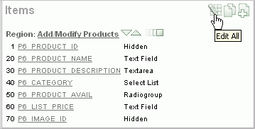
Clicking the Edit All icon displays a series of pages that enable you to edit multiple items simultaneously or view a history of recent changes.
Topics in this section include:
See Also:
"How Item Attributes Affect Page Layout"Item attributes control how items display on a page. You can use the Page Items page to edit the sequence, field label, template, region, and overall position for all items on a page.
A Navigation bar displays at the top of the page. Use the Page field to navigate to another page. To limit the display to just items in a specific region, make a selection from Show Regions list.
See Also:
"Editing Page Item Attributes"The Page Items page displays items in an editable report. Table 6-3 describes each editable attribute.
Table 6-3 Editable Attributes on Page Items
| Attribute | Description |
|---|---|
|
Sequence |
Specify the display sequence for this component. The sequence determines the order of evaluation. |
|
Prompt |
Enter the label for this HTML form element. You may include HTML, JavaScript, and shortcuts. You can also use the substitution string #CURRENT_ITEM_NAME# to obtain the name of the item associated with this label. |
|
Field Template |
Determines the label template. Label templates enable you to define the user interface attributes in a central place and share that definition among many labels. |
|
Region |
Defines the region in which the item displays. All items must be in a region. |
|
New Line |
Determines whether this item displays on the same line as the previous item or whether it displays on the next line. Items are laid out in an HTML table. Select Yes to have an item display as the first field in a new row in the table. |
|
Width |
Specifies the length (in characters) of the form element that displays for this item. |
|
Height |
Specifies the height (in lines) for text areas and multi select lists. |
|
Column Span |
Items are laid out in HTML tables. This property defines the value to be used for the |
|
Row Span |
Items are laid out in HTML tables. The attribute determines the value to be used for the |
Edit the appropriate attributes and click Apply Changes.
Use the Item Help page to edit item help for all items on a page. You can avoid repeating the same Help text in multiple locations by subscribing to another item.
See Also:
"Creating a Help Page"To edit item Help:
Navigate to the appropriate Page Definition. See "Accessing a Page Definition".
Under Items, click the Edit All icon.
Click Item Help.
The Item Help page appears.
Use the Navigation bar at the top of the page to narrow or broaden the display. Available options include:
Page - Select or enter a new number and click Go.
Search - Enter a case insensitive query and click Go.
Show - Select whether to display All, Subscribed, or Unsubscribed Help text.
All Pages - Select to run the search query on all pages in the application.
Current Page - Select to restrict the search query to the current page.
You can also use the arrows in the Navigation bar to scroll through the application pages.
To subscribe to an existing Help item, make a selection from Subscribed To.
To edit help for a specific item, click the item name.
On the Edit Help page:
Reference Master Item Help From - (Optional) Select a existing item Help topic to subscribe to.
Help Text - Enter or edit the Help text for this item.
Click Apply Changes.
Click Apply Changes.
Use the Reassign Region Items page to assign items to a new region.
To Reassign Region Items page:
Navigate to the appropriate Page Definition. See "Accessing a Page Definition".
Under Items, click the Edit All icon.
Click Reassign Region Items.
The Reassign Region Items page appears.
Use the Navigation bar at the top of the page to narrow or broaden the display. Available options include:
Page - Select or enter a new number and click Go.
Show Regions - Select a region to display and click Go.
To reassign an item to another region:
Select the items to reassign.
From Assign to Region, select a new region.
Click Reassign Region Items.
Use the Delete Multiple Items page to delete multiple items at once.
To delete multiple items:
Navigate to the appropriate Page Definition. See "Accessing a Page Definition".
Under Items, click the Edit All icon.
Click Delete Multiple Items.
The Delete Multiple Items page appears.
Use the Navigation bar at the top of the page to narrow or broaden the display. Available options include:
Page - Select or enter a new number and click Go.
Show Regions - Select a region to display and click Go.
Forward (>) and Next (<) buttons - Display the previous and next page.
To reassign an item to another region:
Select the items to reassign.
From Assign to Region, select a new region.
Click Reassign Region Items.
You can quickly edit the label and position of items in a region by clicking the Reorder Region Items icon on the Page Definition. This icon resembles a light green down or up arrow.
To use the Reorder Region Items icon:
Navigate to the appropriate Page Definition. See "Accessing a Page Definition".
Under Items, click the Reorder Region Items icon.
The Reorder Region Items page appears with items laid out in tables. You can edit the position of an item by selecting values for New Line, New Field, Column Span, and Label Alignment attributes. Note that a graphical representation of how the items display appears at the bottom of the page.
To edit an item label, enter a new title in the Label field.
To change the position of an item, edit the following attributes:
New Line. Determines if the item displays on the same line as the previous item, or displays on the next line. Select Yes to have an item display as the first field in a new row in the table.
New Field. Determines if the item displays in the next column or in the same column as the previous item. Select Yes to have the label and value for the item display in a new HTML table cell. Use this attribute in combination with the New Line and Span attributes to control layout.
Column Span. Defines the value to be used for the COLSPAN attribute in the table cell. The COLSPAN attribute defines the number of columns that it spans across the table.
To change label alignment, make a selection from the Label Alignment list.
To change the order in which items display, click the up and down arrows in the far right column. Clicking the arrow moves the item one row up or down.
Note that the order you specify here translates to sequence number in the Sequence attribute on the Edit Page Item page. See "Editing Page Item Attributes".
Click Apply Changes.
Tip:
You can also use the Drag and Drop Layout feature to reorder items. See "Using the Drag and Drop Layout Page".Note:
To change the region in which an item resides, you must edit the item attributes. See "Editing Page Item Attributes".You can use the Drag and Drop Layout page to interactively reorder items within a given region, change select item attributes, create items, or delete existing items.
Topics in this section include:
You access the Drag and Drop Layout page by either:
Clicking the Drag and drop icon on the Page Definition. See "About the Drag and Drop Icon".
Clicking the Reorder Regions Items icon and selecting the Drag and Drop Layout tab. See "Using the Reorder Buttons Icon".
The Drag and Drop Layout page is divided into two sections: Item palette and Layout region.
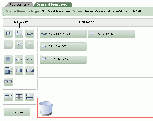
The Item palette displays on the left side of the page. You add items by clicking an item type on the palette and dragging it to the correct position in the Layout region. Note that when you position the cursor over an item type, a tooltip appears.
Use the right side of the page (or Layout region) to position items. To move an item vertically, click the Add Row button to insert an empty row. Then drag and drop the item into the empty row.
See Also:
"Deleting Items"To create a new item on the Drag and Drop Layout page:
Navigate to the Drag and Drop Layout page. See "Accessing the Drag and Drop Layout Page".
Click an item type in the Item palette on the left side of the page and drag it to the appropriate location in the Layout region.
Note that when you position the cursor over an item type, a tooltip appears.
You can reposition the item:
To move an item horizontally, select the item and drag it to the appropriate position on the page.
To insert an existing or new item between two existing rows, click the Add Row button and drag it between the existing rows. This creates an empty row where you can then move the item.
Edit the item attributes at the of the page.
Display Name - Enter an item name. Use this name to retrieve the value of the item. Item names longer than 30 characters cannot be referenced using bind variable syntax.
Label - Enter the label for this item. You may include HTML, JavaScript, and shortcuts. You can also use the substitution string #CURRENT_ITEM_NAME# to obtain the name of the item associated with this label.
Display Type - Select a display type (if applicable). Note that the select list is restricted to options corresponding to the type of item you are creating. See "About Item Types".
Click Next.
Optionally, edit the each item's Name and Label.
Click Apply Changes.
If you create an item that requires a list of values (LOV), the Drag and Drop Layout Wizard creates a static inline LOV for you. Note you must edit and fix this LOV once you complete the layout process.
See Also:
"Creating a Static List of Values"To edit an existing item on the Drag and Drop Layout page:
Navigate to the Drag and Drop Layout page. See "Accessing the Drag and Drop Layout Page".
To reposition the item:
To move an item horizontally, select the item and drag it to the appropriate position on the page.
To insert an existing or new item between two existing rows, click the Add Row button and drag it between the existing rows. This creates an empty row where you can then move the item.
If required, select an item and edit its attributes at the of the page.
Display Name - Enter an item name. Use this name retrieve the value of the item. Item names longer than 30 characters cannot be referenced using bind variable syntax.
Label - Enter the label for this item. You may include HTML, JavaScript, and shortcuts. You can also use the substitution string #CURRENT_ITEM_NAME# to obtain the name of the item associated with this label.
Display Type - Select a display type (if applicable). Note that the select list is restricted to options corresponding to the type of item you are creating. See "About Item Types". See "About Item Types".
Click Next.
Optionally, edit the each item's Name and Label.
Click Apply Changes.
Note:
To change the region in which an item resides, you must edit the item attributes. See "Editing Page Item Attributes".To delete an item, click it and drag it to the Recycle box at the bottom of the page. If you delete an existing item, it appears in the Recycle box and can be retrieved until you click Apply Changes on the next page. Note that if you drop a new item you have just created in the Recycle box, it instantly disappears and cannot be retrieved.
You can reference item values stored in session state in regions, computations, processes, validation, and branches. Table 6-4 describes the supported syntax for referencing item values.
See Also:
"Managing Session State Values"Table 6-4 Syntax for Referencing Item Values
| Type | Syntax | Description |
|---|---|---|
|
SQL |
|
Standard bind variable syntax for items whose names are no longer than 30 bytes. Use this syntax for references within a SQL query and within PL/SQL. |
|
PL/SQL |
|
PL/SQL syntax referencing the item value using the See Also: Oracle Application Express API Reference |
|
PL/SQL |
|
Standard PL/SQL syntax referencing the numeric item value using the See Also: Oracle Application Express API Reference |
|
Static Text |
|
Static text. |
|
Static Text (exact) |
|
Static text. Exact Substitution. |
You can set the value of an item in your application using any of the following methods:
For page-level items, use the Source Attribute to set the item value.
From the Page Definition, select the item name to view the Edit Page Item page. Scroll down to Source and edit the appropriate fields.
You can also set the value of an item in any region based on PL/SQL or a process using the following syntax:
BEGIN
 :MY_ITEM :=  'new value';
END;
Pass the value on a URL reference using f?p syntax. For example:
f?p=100:101:10636547268728380919::NO::MY_ITEM:ABC
Set the value using a computation. Computations are designed to set item values. For example:
TO_CHAR(SYSDATE,'Day DD Month, YYYY');
Use the PL/SQL API to set an item value within a PL/SQL context. For example:
APEX_UTIL.SET_SESSION_STATE('MY_ITEM',SYSDATE);
You can choose to have an item display conditionally or as read-only by editing attributes on the Edit Pages Item page.
To display a conditional or read-only item:
Create the item. See "Creating Page-Level Items".
Navigate to the appropriate Page Definition. See "Accessing a Page Definition".
Under Items, select the item name.
The Edit Page Item page appears.
To display an item conditionally:
Scroll down to Conditions.
Make a selection from the Condition Type list.
Enter an expression in the fields provided.
To make an item read-only:
Scroll down to Read Only Display Settings.
Make a selection from the Read Only Condition Type list.
Enter an expression in the fields provided.
Click Apply Changes.
A multiple select item renders as a multiple select list form element which can be either a Multiselect List or Shuttle item type. When submitted, selected values are returned in a single colon-delimited string. You can handle values in this format in two ways:
Using the INSTR function
Using the APEX_UTIL.STRING_TO_TABLE function
Suppose you had a report on the EMP and DEPT tables that is limited by the departments selected from a Department multiple select list. First, you create the multiple select item, P1_DEPTNO, using the following query:
SELECT dname, deptno
FROM dept
Second, you return only those employees within the selected departments as follows:
SELECT ename, job, sal, comm, dname
FROM emp e, dept d
WHERE d.deptno = e.deptno
AND instr(':'||:P1_DEPTNO||':',':'||e.deptno||':') > 0
Next, assume you want to programmatically step through the values selected in the multiple select item, P1_DEPTNO. To accomplish this, you would convert the colon-delimited string into a PL/SQL array using the APEX_UTIL.STRING_TO_TABLE function. The following example demonstrates how to insert the selected departments into an audit table containing the date of the query.
DECLARE
    l_selected APEX_APPLICATION_GLOBAL.VC_ARR2;
BEGIN
  --
  -- Convert the colon separated string of values into
  -- a PL/SQL array

  l_selected := APEX_UTIL.STRING_TO_TABLE(:P1_DEPTNO);

  --
  -- Loop over array to insert department numbers and sysdate
  --

  FOR i IN 1..l_selected.count
  LOOP
    INSERT INTO report_audit_table (report_date, selected_department)
        VALUES (sysdate, l_selected(i));
  END LOOP;
END;
See Also:
"STRING_TO_TABLE Function" in Oracle Application Express API Reference
|
 Copyright © 2003, 2013, Oracle and/or its affiliates. All rights reserved. Legal Notices |
|